‘Insight’ into my Modern Research Website
Developing a modern research website to promote the Insight Lab

Understanding Research Blogs
My researcher, Ying Choon Wu of the Swartz Center for Computational Neuroscience, was about to enter a joint-lab collaboration when she realized that she needed to rework her current blog so researchers could get a better idea of her and her past research. She called upon Cang and I, her assistants, to help redesign it knowing our previous web and design experience. The website only contained the Homepage and the About, which already told me we had a big project in store for us.


To better understand what a research blog is and what we should aim to achieve, we began by researching other research blogs. Common features included filters based on tags or year, a footer for contact information, About and Project pages, and a cover image of the lab. The use of a homepage was mixed, as a lot of blogs opened with their most recent posts. At most a short bio introduced the lab off to the side.

Combining our initial issues with the website and our research of research blogs, we decided to address the biggest issues we found through a Figma prototype and reaffirm our suspicions by interviewing reseachers. The biggest issues that we identified were:
- Convey a clearer connection to Ying and the Insight Lab
- Create a layout that is easy to customize but consistent
- Separate members from posts from introductions
- Separate or organize related posts
We did not have a concrete measurement for whether our new website was successful, however we considered it so if other labs and research assistants began reaching out to Ying more because of the website’s exposure.
Our Re-modernized Solution
Cang and I gathered feedback from researchers and built the website on Wordpress, which consisted of a Homepage, Project page, Team Member page, About, and Publication page. To ensure that Ying would be able to maintain the website after we left, we created tutorial videos and reusable components to help her learn Wordpress and make new projects and posts as quickly as possible. Feel free to check it out at https://www.insight.ucsd.edu.
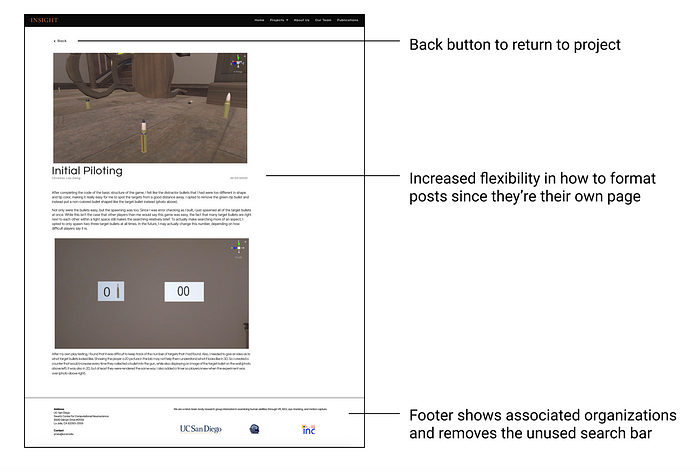
We believe that we achieved our goals in that incoming researchers who browse the website should have a clear understanding of what the Insight Lab is. The Homepage, Team Member page, and About convey a clear image of the lab. Elementor components ensure that the black header, cover image, and other premade components for each page are consistent. The Project pages, Team Member page, and About separate the three types of posts, with Projects also filtering posts into their respective projects.


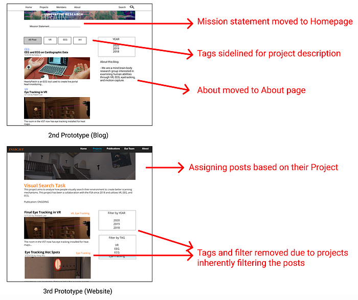
A major feedback that we gathered from researchers was the need for a Homepage. In our second prototype, which still highly resembled Ying’s original layout, we realized that they were confused about the prototype’s purpose. Even though we had a mission statement on the top and an About on the side, we realized that confused purpose led to confused navigation. By creating a Homepage we could quickly introduce the website and allow researchers to navigate to the information that they were interested in.
Another topic that came up was the need for Publications. One interviewee liked a post that had a citation because they could get a better understanding of the post’s contribution to the overall picture. He asked where to find the rest of Insight’s publications, to which we realized we hadn’t implemented one since we were so focused on the posts. I believe this was the point where the end-goal became less of a blog and more of a website, giving more focus to the Insight Lab than implementing its posts for research purposes.
Redesigning from a Blog to a Website
Our designs had a crazy change in design when we moved away from the blog format. We started to think beyond the posts and what we needed to do to make the website encompass more of the Insight Lab. As mentioned above, the Homepage was added to help guide users by explaining the Insight Lab and give them clear navigation buttons to explore the website.
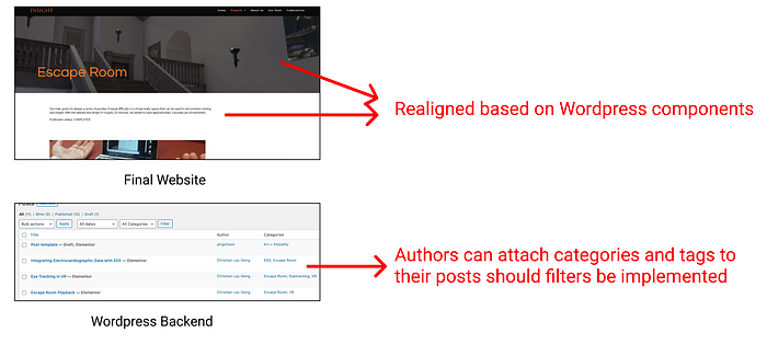
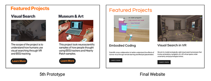
The most difficult concept was reorganizing the projects. Since we didn’t have any Homepage or Projects page developed yet, it was a huge change figuring out how to introduce the projects, make the website inviting, and use the existing filters. Projects received their own project pages from prototype feedback and removed filters when developing on Wordpress (see below). However the concept of filtering still remained in the backend, as authors can attach categories and tags to their posts (should filters ever be implemented).
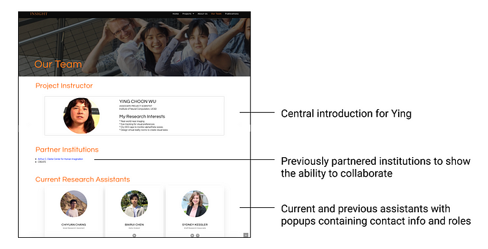
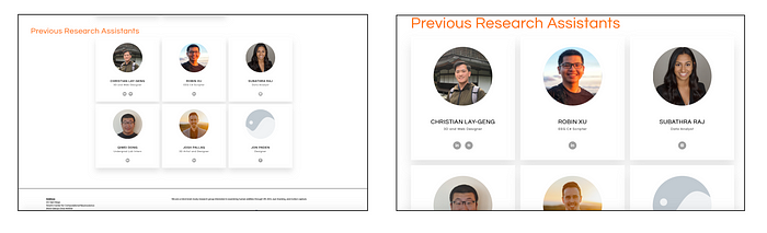
The most difficult page to implement for me was the Team Member page as it tested me in many technical features I hadn’t encountered before. In our last Figma prototype, it was very distracting in the Team Member page to scroll through 15 students profiles when the information is not very relevant to a researcher, so we used Team Member Cards to popup student info. That way it gives the same impression of the lab’s size to researchers without taking their time to scroll through all the profiles.
I have coded with CSS and HTML before when building apps, but only learned in-theory the importance of scalability. Now that I had the tools to make the code for me, I spent time learning how and why to use them. When working with the Team Member Cards for example, Cang taught me to set the cards to ‘boxed width’ and to use ‘% padding’ so they would have consistent sizing across devices or magnifications, while I figured how to crop photos to center nicely in the profile picture.
Appearing Professional and Clean
As this website represented the Insight Lab and would be showcased to other researchers, we wanted to make it as professional and clean as possible. We chose to use cover images on the top of our pages because we wanted to make the site as inviting as possible and because most other research blogs had some sort of banner, logo, or project on the top of their pages. We chose not to rely on existing patterns because we were creating our own components and thus would have different layouts from other research blogs to begin with.

We used a moodboard to figure out what colors would best represent a neuroscience lab. We collected a bunch of neuroscience related images and saw black, white, blue, and orange to be the most predominant colors. We took inspiration from neuroimaging scans and wanted to have black backgrounds. During prototyping we considered blue font or blue hovers, but found that we needed to squint to read blue text on black, while orange was visible against black and white. We also never had a page complex enough that benefitted from four different font colors. By sticking to black, white, and orange it helped to create a modern layout we wanted that didn’t detract the user’s gaze and was easy to read.
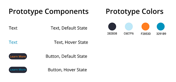
When deciding our fonts, we wanted to use San Serif fonts to make posts and text very easy to read. We initially prototyped with Neue Montreal as our font, which is considered a cousin to Open Sans, one of the easiest font families to read online. When moving to the final website, we realized we would have to download it. Not that there was anything wrong with downloading it, but we didn’t want to cause any future issue with future developers.
For the final website we chose Inter for our main text and Questrial for our bolded header fonts. Inter is more narrow than Questrial, which would help reduce the distance people read whereas Questrial’s extra width helped make it easier to bold for titles. Choosing the right font is actually difficult to estimate considering the website was wider than our prototype, something that we didn’t account for when building the prototype.
Final Outcome
The website took approximately four months from start to finish, although we continued to fill in more posts and find magnification errors after that. We may consider visting other features not directly part of the website like SEO (for searching) should the issue come up.
The website was finished after Ying’s collaboration deadline, but she was able to find partners without it. She was very happy with the design, as it would have been time consuming for her to fix and she could now use it for future collaborations. To ensure that Ying would be able to finish the website and get help from future research assistants, tutorial videos and post-weekly meetings were designed to help her get adjusted to the new design.
I learned a lot about web development during this project. For the most part my projects have been in app development, thus it was very different having more freedom and space to design. Rearranging components horizontally into wider screens was a relatively new experience for me, and something I’d like to experience more in the future. Coding with scalability in mind for example was another huge change, as I had to learn about setting the width and padding of Wordpress elements as a newcomer. There were many ideas or UI we were not able to implement because the two of us were busy and still beginners in Wordpress. However it was also a great change, as having pre-made tools and widgets allowed me to address other issues like scalability without being restricted by my coding knowledge.
I also learned a valuable lesson in teamwork, as it was my first project in a two-person group. In the past I have worked with larger groups where we could brainstorm off of each other, compromise, and split word more evenly. In this situation if we disagreed with each other, there was no easy way to come to a compromise other than interviewing researchers (which was not easy) and Ying (who was very busy). Furthermore, Cang and I had very different strengths and availability, making communication very important as one could have to wait for the other to finish. On the other hand, it was very interesting covering a lot of different roles, and certainly beneficial when I work in fast-paced work environments in the future.