Value of Communication in City Outreach
Streamlining the reporting and feedback process at Get It Done San Diego

Get It Done and its Lack of Communication
Get It Done is a public service created by the City of San Diego in 2016 to allow residents to report non-emergency problems for the City to take care of, including trash, parking, graffiti, vegetation, and encampment problems. Residents submit a report either on mobile or browser with the location and explanation, and Get It Done refers the problems to the right department and closes the report when it is completed. The City aims to establish direct user relations and improve resident experience with the Get It Done platform.

Problems arose when users complained that their reports were not being actually completed. When a report was closed, users wouldn’t get personalized feedback. And when some visited the site in-person, most found that their vegetation or their littering problem hadn’t actually been resolved.
The platform is user-friendly but the response time is in need of a reform.
It’s average. A couple of times, the problem was fixed; a couple of times, it wasn’t.
Tracking was also non-existent, which caused a huge problem among its users. Without any ability to view the report progress, they opted to re-submit reports multiple times without knowing if their problem had been seen or outsourced to another department, causing follow ups to be immediately closed when they weren’t dealt with yet. Since users cannot comment or edit reports, there was a lack of engagement on both the user and Get It Done side.
There was no progress — reports and issues were just closed with no specific reason and no means to follow up. It took three reports and multiple phone calls to get an answer.
One out of four were repaired and closed. Two say “in process” but are 99 and 138 days old. Last one says referred, but I don’t know what that means.
This incentivized our student-run UX group, Fi@UCSD, to create a project with the agency to improve their relations. In both app-stores and in our surveys, the service averaged a 3/5. This meant that the service was working and reports were being handled, but the most favorited comments discussed the lack of communication and progress in the reports. Although there were various problems we identified, here were some of the more impactful problems from our user research:


Another key issue was that the user flow was completely different on the browser from the app. Get It Done was specifically designed to be a very straightforward app intended for older audiences. However on the browser, not only is it unintuitive to figure out how to report, but the terminology and order of the services are different as well, creating an inconsistency within their own service. This makes it difficult for app users to learn how to use the browser, especially since account information isn’t shared to allow people to post anonymously.

After surveys, interviews, our own expert reviews, and a competitive analysis, it led us to identify three major pain points we wanted to address, along with a lot of other minor broken buttons and mobile/web inconsistencies:
- Difficulty tracking progress of reports
- Underutilized mobile features
- Lack of clear guidance

Increased Feedback in our Solution
Our team organized our solutions and created a final Google Drive containing our raw data and UX audit report. Every user we surveyed and interviewed used the app, so we tested and delivered a Figma app prototype for Get It Done, while translating our browser changes via an implementation documentation. The team presented our findings and our prototype to members of Get It Done after working on the project for five months.
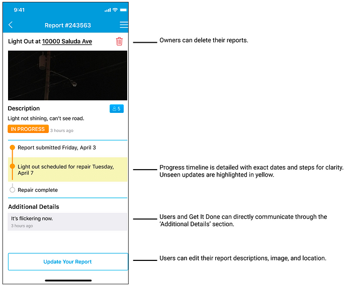
We believe that our Figma app solved our three major pain points. We added updates between users and Get It Done in tracking so users clearly understand what was done. Secondly, our updated app anticipates the actions of adult users from our research phase and integrates basic features more efficiently into the reporting process. Lastly, we made sure to clarify new and old features by adding info icons, descriptions while reporting, and label buttons with text. Here are some of our biggest changes:
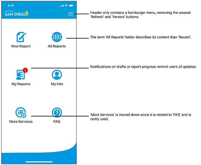

Complex Button and Form Interaction
To resolve our first two major pain points required an insane amount of updates to the current interface. But we only had a vague idea of the backend report lifecycle, like what variables were saved or when was a report considered resolved, to properly address the first pain point. So all we could do is suggest features we thought were a mix of ideal and practical.
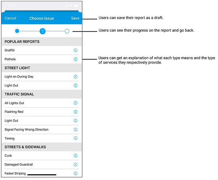
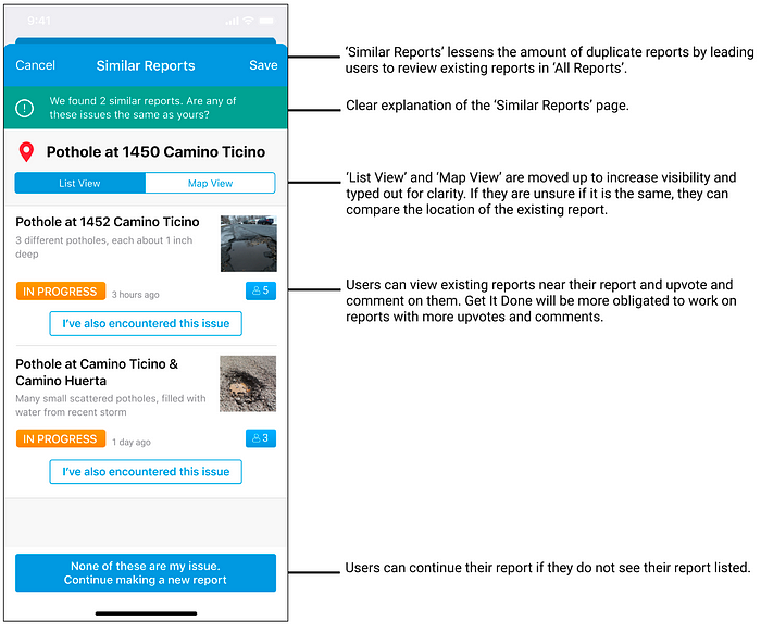
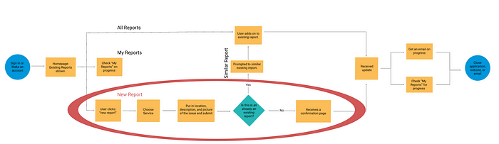
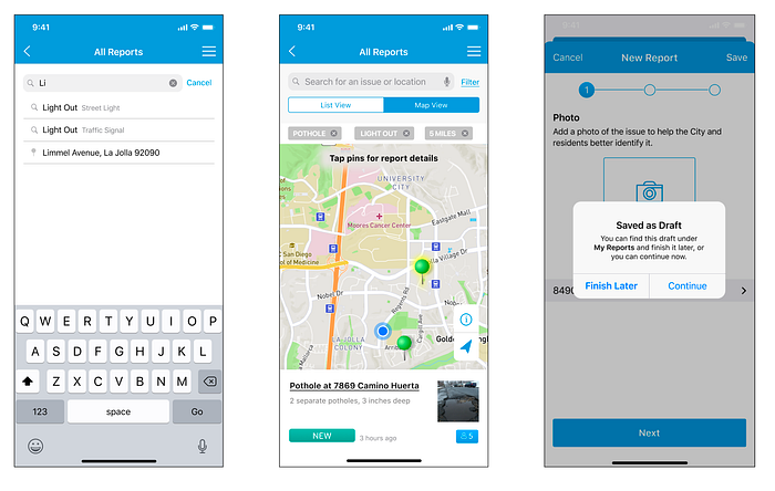
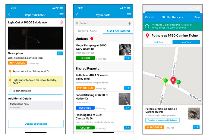
The biggest and hardest interaction problem for us was the ‘New Report’ process. Not only was it the feature that users used the most, but also the most complicated. Besides trying to include a ‘Similar Reports’ feature, our focus was spent reordering the order/screens to feel natural.
In our paper prototype we made every input their own screen as the input before affects some of the details in the next screen. However users showed this made the process feel much longer and confusing, as for some it made it harder to understand what each screen did. We shortened it each iteration and eventually came to resemble the existing app. We removed editing in our final confirmation screen as being able to edit previous parts of the process could change the options in the rest of the report.
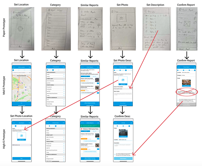
To make sure that both the older users and Get It Done understood some of the features we were implementing, it was very important to simulate the motion in our prototoype. One of the most challenging places was in ‘Map View’, where we allowed users to reposition the map. Figma is well suited for switching between screens, but it took us a while to recreate moving the map (by creating a frame underneath it) because it was still the same screen. Mimicking these features helped us to keep immersion with the older users and give these features familiarity by making them flow nicely.
High Visual Standards for Get It Done Users
To ensure that the app clearly expressed our new features and could be implemented, we recreated components that matched the existing Get It Done visual aesthetic. Our Expert Review and Design System teams took time to understand the visual aspects of the app and recreate a style guide in Figma to ensure that everyone working on the final prototype kept a consistent layout.
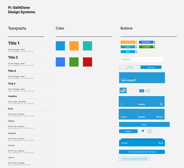
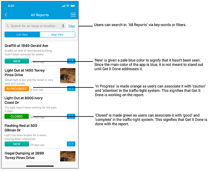
Since we had the existing app for typography and components, we changed a lot of color to create guidance depending on their appropriate step in the process. Report tags, for example, were changed to aqua, yellow, and green based on the type of alert. We wanted features that were more systematic to be closer to blue or aqua like the upvote and the ‘Similar Reports’ description, so that more relevant features used color to stand out like the report tag.
Through user testing we learned that users could get lost in our new features. prompting us to use a yellow highlight in certain areas for recent information. Lastly we added the brightness of red for important features like the update icon and map location. Unlike the other colors, red was not a part of the existing app. However we felt red was necessary to draw the user’s attention to actionable features directly pertaining to them if they were getting lost.
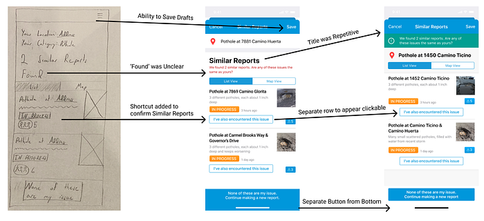
Many of our added features had very complex designs, causing us to be very attentive of user feedback. In the paper prototype for example, a user did not know what ‘found’ meant in ‘Similar Reports,’ prompting us to create a description and suggest users to explore the provided reports. In the mid-fi prototype, multiple users could not recognize the new buttons that we added, prompting us to make them visually more clear by centering them and giving them separate rows. Being attentive to how users got lost in user testing helped ensure our new features were easily understood.
Final Outcome
Of the 30 changes the team recommended to Get It Done, approximately 8 changes were implemented to the app and browser months later. Of the 8, 4 of which were not changes that we identified. On the app, auto location and report feedback greatly increased the client-side communication that we wanted to achieve. Get It Done also added to the browser a description for each service and the availability of services under COVID restrictions.


On both Apple and Google Play app stores after these updates, reviews continued to average a 3/5 rating. There were relatively few positive reviews.
Was directed to the proper phone number.
When I report graffiti it gets reported. That’s all i want.
There were neutral reviews, mostly critiquing the newly implemented auto-location feature.
The app chose a physical address and didn’t allow me to give the correct intersection. Allow app to accept street intersections.
I use the SD Get It Done app occasionally, and appreciate that you offer it to us, but one very frustrating issue is… the automatically “corrected” location is always wrong.
Lastly there were many negative reviews about the app crashing or unaddressed reports, which wasn’t too different from earlier reviews. However users were extra upset considering an update was pushed and they were still running into the same issues.
The new update has a small glitch, when you click on image of report and then click back button it takes you back to beginning of reports,(bug fixed as of 3/31/20). But as of 4/1/20 you’re STILL just closing the reports and saying its been addressed and it hasn’t!!
I’ve used this twice and both times, the issues were closed without comment or resolution. Failed city government in action. They try, but app only ever reports “failed to create”.
About as effective as calling. Four days later the neighbor’s trash is still in the alley so it seems about par for the course.
It is worth noting that at the time these were written, COVID-19 impacted available services and the speed of Get It Done to tackle them. However on the web browser it shows only 4 services impacted and these were not mentioned among the reviews, meaning that these comments still hold some validity regardless of COVID-19 or not.
I found it a shame that very little of our prototype was implemented, but recognize that our design was difficult and ambitious. I believe that the UX guidance came too late into the app’s development, and that it was impractical for the app-development team and the Get It Done team to change the amount of features we suggested. As the only member on the team with previous app-development experience and the one who translated the Salesforce browser implementation, I think the way we created some new features like ‘Similar Reports’ (accessing variables in ‘All Reports’) were logistically impossible for Get It Done to implement. While I think the development team addressed our pain points with the simplest changes on the existing app, it appears by current reviews that these changes were unnoticed or actually angered users more for being glitchy.
This project taught me the importance of identifying client goals. Both organizations wanted to increase client-side communication in the design proposal. However, I do not believe any bounds were specified. By the Solution Development Phase, I believe our range of changes was bigger than what Get It Done could actually implement. Alternatively, because we started when the COVID virus began, it was difficult to get a response from Get It Done or understand behind-the-scenes what was or wasn’t possible because we never met with the engineers to recognize it. Regardless, I believe this was a big oversight in our team, even if the slow response time wasn’t our fault.
I found this project to be very valuable, as being able to work with an actual client taught me the importance of communicating with client stakeholders. I believe the team’s build-up of almost entirely designers was a crucial mistake in understanding our limitations, however there were also many factors that were outside of our hands. I believe even if the implementation wasn’t what we wanted, the 4 issues we had identified proved that Get It Done valued our work and understood our intent.